From Design to Code: Converting Mockups Properly
Your design looks great — but does it translate to working code? This guide covers the handoff process that prevents headaches.
The Gap Between Design and Development
There’s a moment that happens on almost every startup web project. The designer finishes the mockup. It looks polished, professional, ready to go. Then it lands on a developer’s desk — and suddenly there’s confusion.
The spacing doesn’t match. Font sizes are ambiguous. Hover states aren’t documented. Colors are specified three different ways. What should’ve been a straightforward handoff turns into back-and-forth emails and meetings.
Here’s the thing: this isn’t anyone’s fault. It’s just that design and code speak different languages. A mockup is a static image. Code is alive, responsive, interactive. Bridging that gap properly saves weeks of work and prevents frustration on both sides.

Before You Hand Off: The Designer’s Checklist
The handoff process starts before you actually hand anything over. Spend time on preparation now, and developers won’t spend time asking questions later.
First, organize your design file properly. Use consistent naming for all components. Don’t name one button “Button_Primary_v2” and another “primary-btn-final”. Create a clear folder structure. Group related elements. If you’re using Figma, use components — actual reusable components, not just copies. This makes it obvious what’s a variant and what’s unique.
Second, document everything that can’t be seen. Colors need hex codes or RGB values — not just “that blue one”. Typography needs specifics: font name, weight, size, line height. Don’t assume the developer will match it perfectly by eye. Spacing matters too. Write down padding and margins for key elements. Breakpoints for responsive design should be explicitly noted (320px mobile, 768px tablet, 1024px desktop is standard).
Third, think about states. Every interactive element has multiple states: default, hover, active, disabled, loading. Design all of them. A button isn’t complete with just the normal state. You need to show what happens when someone hovers over it, clicks it, and can’t interact with it. Document these differences clearly.

The Specification Document: Your Handoff Blueprint
A proper design-to-code handoff needs a specification document. Not a 50-page manual — something concise, visual, and useful.
Include these sections: Color palette with actual hex codes (example: #0f172a for primary dark, #f1f5f9 for primary light). Typography scale with font families, weights, and sizes. Spacing system using consistent increments — most startups use 8px base units or 4px (so 8px, 16px, 24px, 32px, etc.). Component specifications for each UI element: buttons, form inputs, cards, navigation, modals. Every component should show all its states.
Don’t forget responsive behavior. How does this design adapt at 320px (small phone), 768px (tablet), and 1024px (desktop)? Does that hero image change? Do columns stack? How do margins adjust? This is critical information that’s easy to miss in a static mockup.
Some teams use Figma’s built-in handoff features, which work great. Others create a separate PDF or shared document. The format matters less than completeness. Whatever you choose, make sure developers can quickly find the information they need without asking.
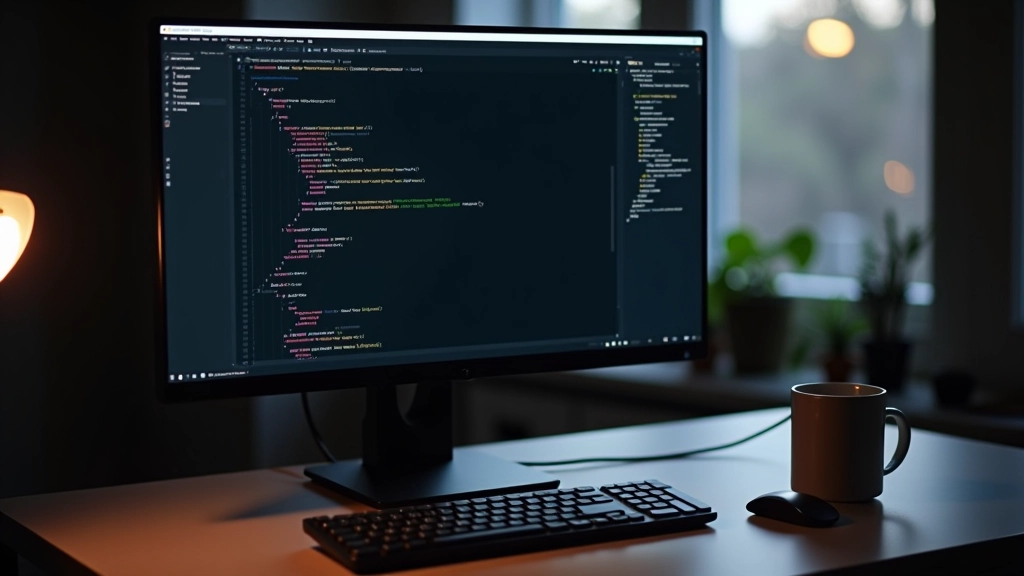
The Developer’s Part: Converting to Code
Developers shouldn’t guess. They should code based on clear information. But even with perfect specs, some flexibility is necessary.
Here’s what a good developer does: First, they build a CSS system from your specifications. Colors become CSS variables. Typography scales become classes. Spacing values get documented. This usually takes a day or two but saves countless hours later. When the client asks to change the primary color, the developer changes one variable and it updates everywhere.
Second, they build components in HTML/CSS that match your mockup. Not pixel-perfect necessarily — responsive design means some variation at different sizes is expected. But the proportions, spacing, and visual hierarchy should match what you designed. If you specified a button at 48px tall with 16px padding, that’s what they build.
Third, they test responsiveness. Does it actually look good at 320px, 768px, and 1024px? Does text remain readable? Are touch targets large enough on mobile (minimum 44px recommended)? Does anything break? This is where design and code truly meet — because a design that doesn’t work at mobile breakpoints isn’t complete.

The Review Loop: Getting Feedback Right
Code doesn’t match the mockup perfectly — and that’s often fine. But some things do need adjustment.
When reviewing coded work, designers should focus on: Does it look like the design? Not pixel-perfect, but visually similar. Are the proportions right? Is the spacing consistent with the specification? Do interactive states work as designed? Do colors match? Can you read all the text easily? These are the questions that matter.
Be specific with feedback. “Make it more blue” isn’t helpful. “The button background should be #3b82f6 not #1e40af” is clear. “The spacing between sections feels off” needs more detail: “Increase the margin-bottom on the hero section from 2rem to 3rem.”
It’s also worth testing in actual browsers. A mockup looks perfect in Figma. Real browsers on real devices sometimes surprise you. Font rendering differs. Spacing can shift slightly. Colors display differently on different screens. View the actual website on phones, tablets, and different browsers. You’ll spot issues that static mockups miss.

Common Pitfalls and How to Avoid Them
Vague Color Specifications
Saying “use that blue from the hero” doesn’t work. Colors need hex codes (#3b82f6) or RGB values (rgb(59, 130, 246)). Use a color picker. Document every color your design uses.
Forgetting Mobile Design
Design the mockup for desktop, sure. But you must also design for mobile. Show how navigation collapses. How text wraps. How images scale. Don’t assume the developer will figure it out.
Inconsistent Spacing
Using 16px here, 18px there, 20px somewhere else makes code messy. Use a consistent spacing scale. Most teams use 8px increments: 8, 16, 24, 32, 40, 48, 56, 64. Stick to it.
Missing Hover and Active States
Interactive elements need multiple states. Buttons need default, hover, active, disabled. Links need default, hover, visited. Show all of these in your design.
Unrealistic Font Sizes
Fonts that are beautiful at 72px in the mockup might be unreadable at actual sizes on screen. Test body text at 16px. Test headings at their actual display sizes. Does it work? Is it readable?
No Documentation for Complex Interactions
If a component has complex behavior — a dropdown menu that animates, a modal that slides in, tabs that switch content — document it. Mockups are static. Describe how it should move and when.
Best Practices for Smooth Handoffs
The best design-to-code handoffs happen when designers and developers communicate like partners, not adversaries.
Start conversations early. Don’t wait until the design is 100% done. Have developers review mockups mid-way through. They might spot feasibility issues or suggest technical approaches that affect design. A designer designing without understanding code constraints often creates things that are beautiful but difficult to build. Collaboration prevents that.
Use real tools. Figma, Adobe XD, or similar platforms have handoff features built in. Use them. They let developers measure distances, extract color codes, and view specifications without emailing files back and forth. It’s efficient and reduces errors.
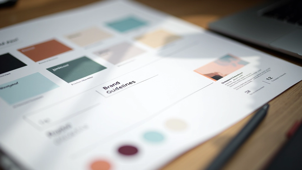
Create a design system, not just a one-off mockup. Document patterns that repeat. If you’ve designed three different card layouts, create a card component with variants. If you’ve used the same button style ten times, document it once as a component. Developers can then build from components instead of guessing at variations.
Plan for iteration. The first coded version won’t be perfect. The second usually isn’t either. Build in time for refinement. The design-to-code process is collaborative. Designer says “the spacing here feels tight.” Developer adjusts it. This back-and-forth improves the final result.

Ready to Build Your Startup Site Right
The design-to-code handoff doesn’t have to be painful. Clear specifications, good communication, and realistic expectations make all the difference. Your design deserves to become great code.
Explore More Design Guides

Educational Content Disclaimer
This guide is provided for educational purposes to help designers and developers understand best practices for converting mockups to working code. Specific tools, software versions, and methodologies mentioned reflect common industry standards as of February 2026 but may change. Every project has unique requirements — adapt these recommendations to your specific circumstances. Your team’s workflow, technical constraints, and project scope will determine the best approach for your startup’s web design process.